

This is part of a series where I deep-dive into my favourite First Draft Pro features and how they were designed, because I love understanding the story behind a thing, and you might too! If you’d like to give your own feedback on this or any other feature (I love feedback, especially yours) you can do that here.
I love reading about writer’s processes. I love when there are rituals involved, exact timings, specific environmental requirements, as if the act of creating fiction is a spell we are trying casting on ourselves each day; I love when a writer explains the difficult act of extracting words from themself, but also love when the words come easily, when there is no rhyme or reason, it just pours out, unstoppered. No logic, just magic.
When I learn from writer’s routines and from talking to other writers about how they do the hard work of making art, it’s always so interesting how many different ways there are to approach writing a book. And when it came to designing an app in which to write a book I thought a lot about how to create just the right amount of structure, and still leave flexibility (but not too much!).
I knew that writers might come to First Draft Pro because it was collaborative, or because of the plotting and outlining features, or the structure guides, or because it was designed with neurodivergence in mind, but that regardless of what feature(s) drew them in, they would spend the vast majority of their time in the manuscript view: writing.
So, even though the other features of the app were super important, everything would fall apart if I didn’t get the manuscript and text editor right.
Core design concepts
Design is about form and function, and research is super important! These concepts shaped my approach to designing the writing and manuscript features of the app:
Cognitive overload is essentially on every one of these little lists, because every decision you make, every pixel you see, distracts you from actually writing. It was super important in the text editor, because this is where you’re spending almost all your time. This influenced a bunch of decisions:
Lots of white space, easy to read font (and no font decisions).
The toolbar only coming up when you need it, rather than always visible.
The ability to make everything disappear if you didn’t want to see it.
The colours of light and dark mode are also chosen to be soothing, and calm, there are no themes that give you another decision to make or something to ‘play with’ rather than writing.
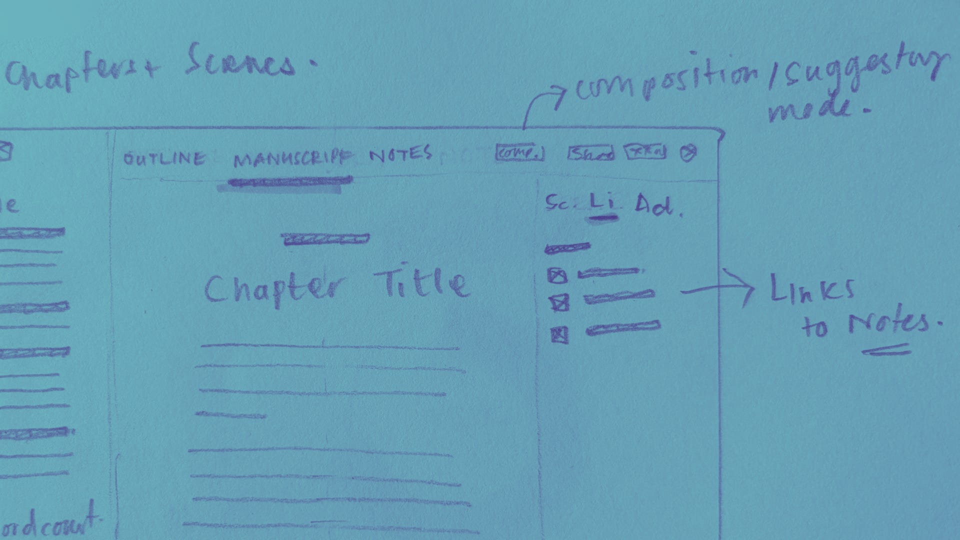
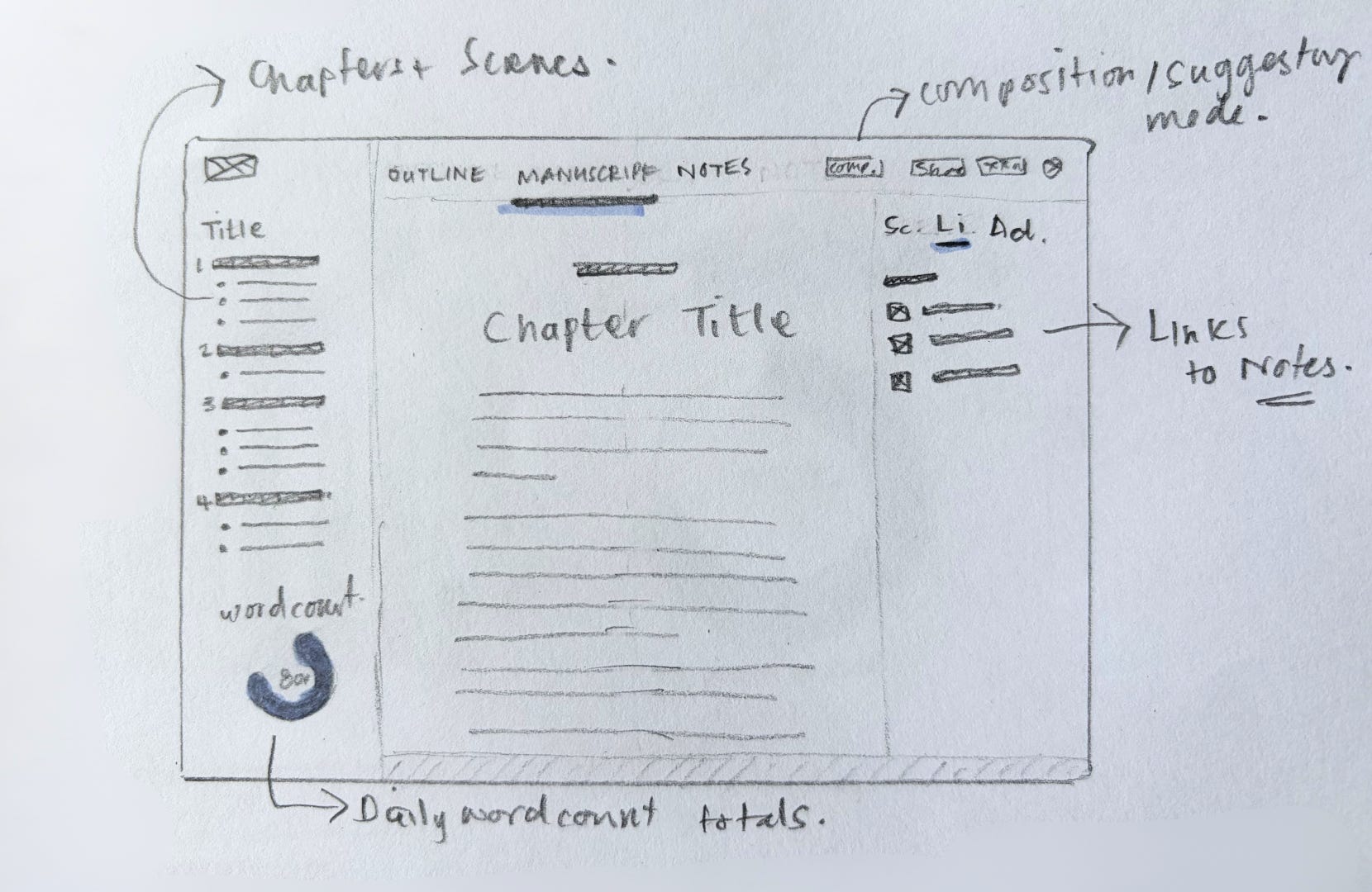
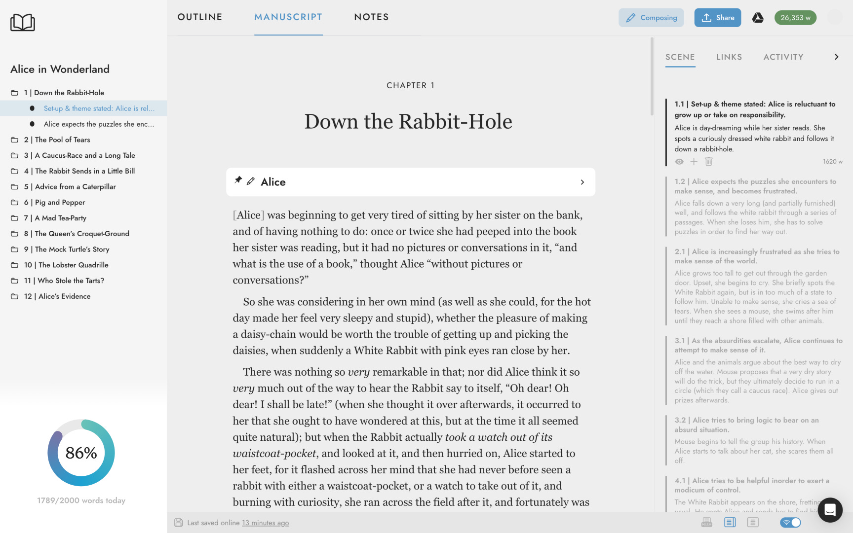
The evolution of the manuscript text editor
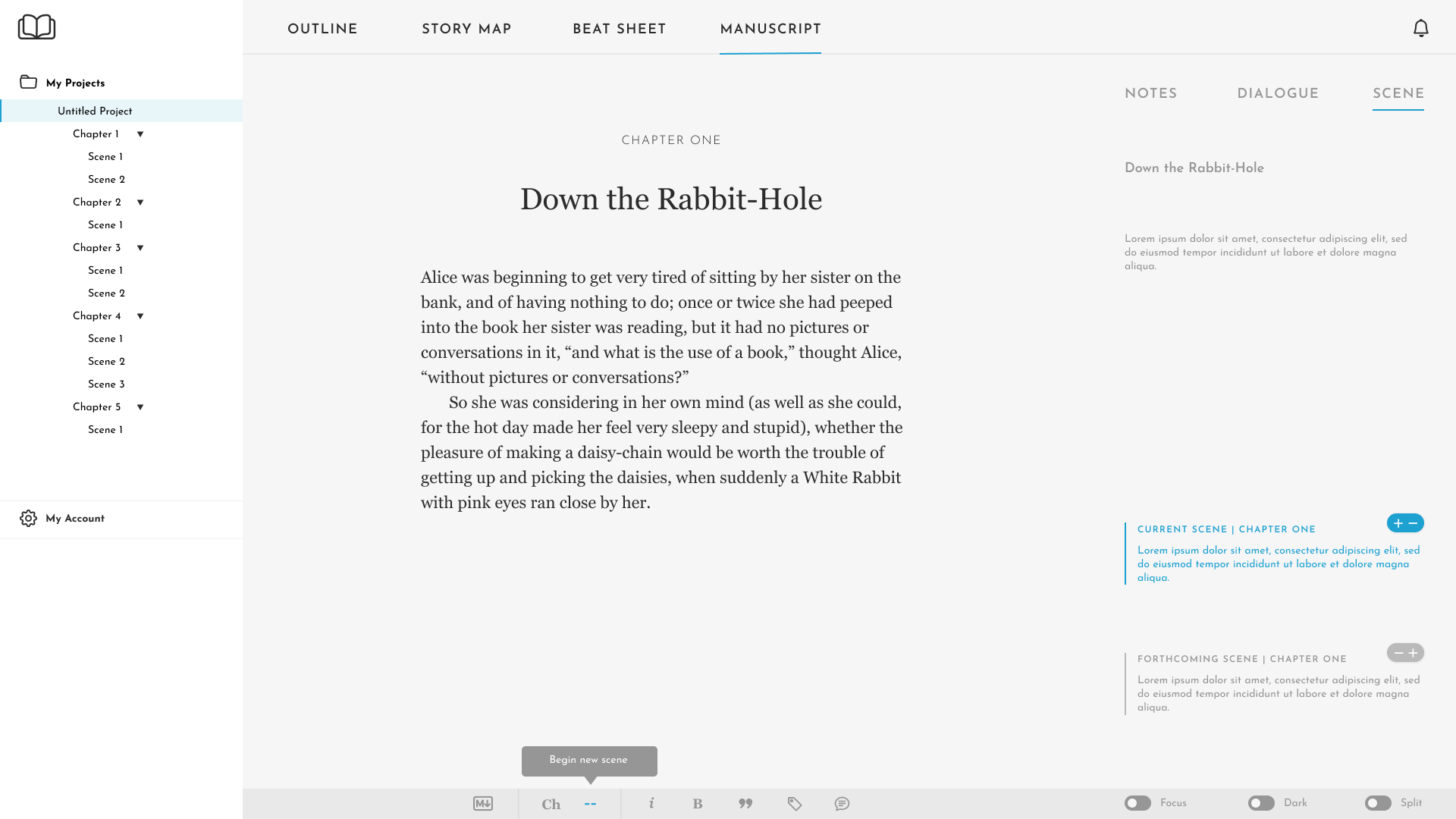
After a lot of testing and feedback from writers, I continued refining the design to keep it clean, motivating, and functional.
Formatting your writing
Sure, writing is about getting words on the page, but you also want your words to look beautiful! So, the manuscript features also include formatting text and adding images:
Format your text with the formatting functions available on the toolbar bubble. Highlight the relevant text and the toolbar will appear.
Add images to your project from the toolbar bubble and resize them to fit your manuscript.
Craft a better story with First Draft Pro
Whether you’re putting your first tentative ideas to paper or making finishing touches, First Draft Pro has great features to help you craft your next bestseller 😉
🖤 And to reward you for getting to the end of my big nerd out :) here’s a discount code for 30% off any First Draft Pro subscription for 12 months: DESIGNDEEPDIVES